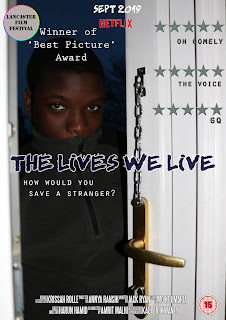
Male Audience: This was designed to appeal to the male audience to divert the idea of the male gaze, so I used a male character for the male audience to relate to and identify with rather than using females to attract short term attention to the film. I also followed this theme through with the colour scheme or blues and greys so that it would typically attract males and they are accustomed to being communicated to with dark colours in common advertising ( such as shampoos and other toiletries or in magazines)

This poster is for the female audience as the character is placed in a way that directly addresses the audience with eye contact. this is used to allow the audience to identify with the character and feel an automatic emotional connection to the character. Also, because females tend tot be more emotionally intelligent they are likely to be able to understand the subtle facial expression of sadness on her face, and understand and question the emotion. This is reiterated through the consistency of the colour scheme which is aesthetically pleasing rather than typically pink and white which usual communicates that the film is for women but not targeting a specific niche audience. Therefore, the red is an example of repetition and difference.

Fans of the genre would appreciate the aesthetic of this poster as it is quite obviously a coming of age which is shown through the two teenage characters, their clothing, and facial expression on both faces. The colours are bright which suggests and reflects a youthful story line.


Comments
Post a Comment